Energy-Focused (Functional Fuel):
Spotlight 25g natural protein and real-food fuel to satisfy hunger and bridge skipped meals between classes.
Product and Branding Design
Energizing Campus Life Naturally

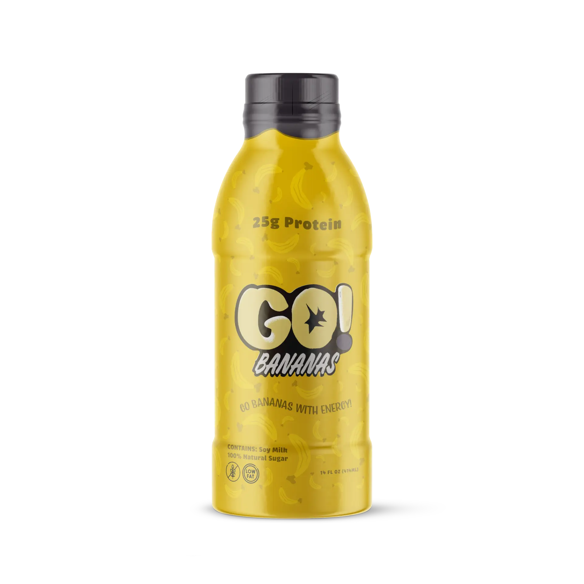
Go-Bananas! is a wholesome, ready-to-drink meal-bridge designed to keep busy college students naturally energized throughout demanding academic schedules. Developed as a vibrant alternative to artificial energy drinks and sterile gym supplements, this project delivers an end-to-end brand identity and packaging system centered on clean, whole-food nutrition and 25g of natural protein. The resulting visual language combines playful, appetite-driven warmth with high-impact shelf presence, offering students a convenient, guilt-free fuel source that fits effortlessly into their daily campus routines.
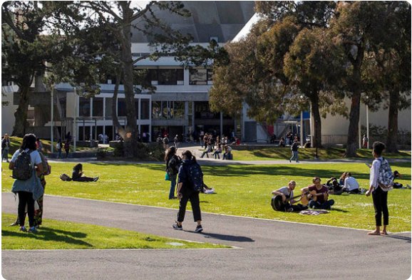
Campus convenience store coolers are crowded with artificial energy cans and clinical gym shakes, leaving busy students with no approachable, real-food fuel. Because current packaging is either hyper-aggressive or sterile, students lack a convenient meal-bridge that instantly signals clean nutrition and appetite appeal on the shelf.
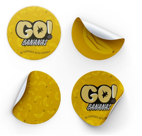
A four-stage design sprint translating student snacking habits into an approachable visual identity, ergonomic bottle label, and brand touchpoints.
How might we combine the playful, high-energy shelf appeal of popular snacks with the nutritional credibility of 25g natural protein to give busy students a guilt-free meal bridge?
Spotlight 25g natural protein and real-food fuel to satisfy hunger and bridge skipped meals between classes.
Ditch sterile, aggressive gym aesthetics for warm, mood-boosting colors and playful typography that make nutrition inviting.
Prioritize bold front-of-pack metrics legible from 6 feet away, eliminating guesswork in crowded campus coolers.
Explore bold typography lockups and vibrant color palettes that capture immediate attention without sacrificing healthy food credibility.
Test and iterate label wraps across cylindrical bottle contours so primary branding and key claims remain legible from every angle.
Experiment with label contrast, background treatments (light vs. dark shrink sleeves), and nutritional callout placement to cut through crowded retail coolers.
Environmental product staging generated via Adobe Firefly.
Go Bananas with Energy! — 16s Brand Promo (Created in Adobe Express)