

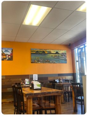
All projects

Brand Redesign

Café Guatemalteco

Infusing Culture into Branding

My Role

Brand & Visual Designer

Project Duration

3-Week Sprint

Tools: Adobe Illustrator, InDesign and Photoshop
  • Brand Strategy
  • Packaging
  • Identity System
  • Environmental Signage
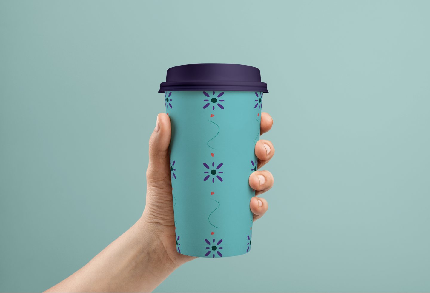
Café Guatemalteco cup printed with the Café Guatemalteco sunburst and heart mark

Project Overview

Café Guatemalteco is a local independent café celebrated for its traditional coffee and an exceptionally warm, conversational atmosphere inside. However, there is a jarring disconnect between the shop’s welcoming interior experience and its understated, low-contrast exterior, leaving the brand inconsistent and overlooked from the street. This self-initiated redesign establishes a cohesive, high-visibility identity that aligns the physical storefront with the vibrant cultural space within.

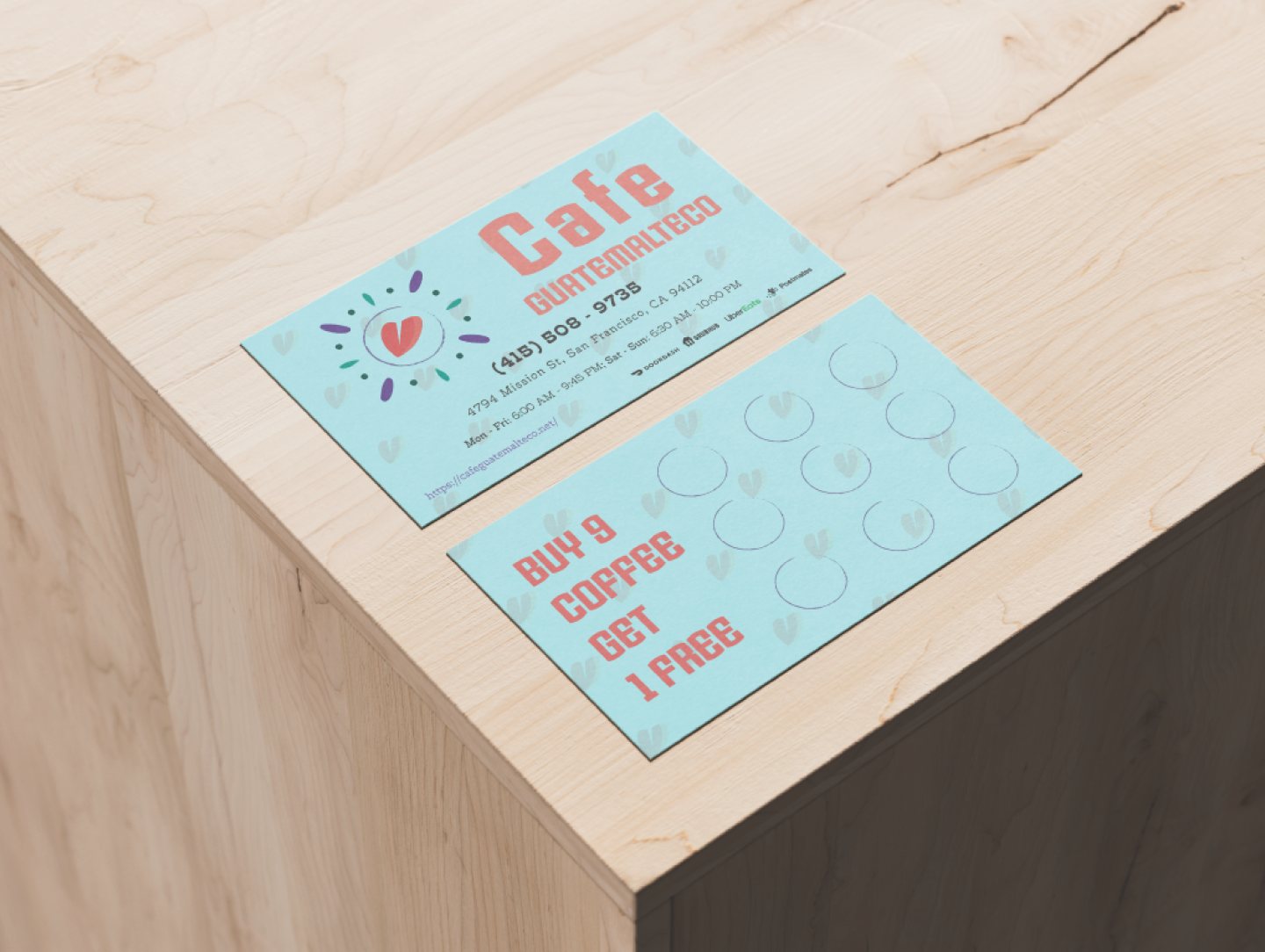
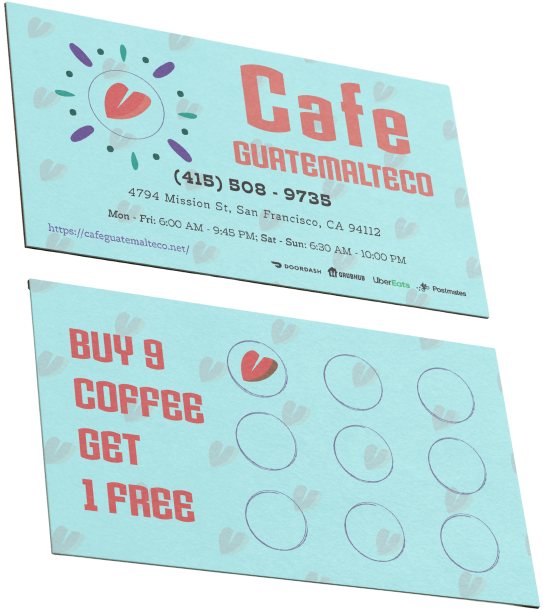
Café Guatemalteco business card and buy-nine-get-one-free loyalty card

Problem Statement

Café Guatemalteco suffers from an exterior discovery barrier, where faint signage and low-contrast visuals cause the storefront to blend into the street and go unnoticed by passing commuters. Because the brand lacks a high-impact, consistent visual system, its vibrant interior culture fails to translate to the sidewalk, resulting in lost foot traffic and weak neighborhood recall.

Target Audience

  • Neighborhood Locals & Commuters: Pedestrians walking the commercial strip who appreciate independent coffee shops but currently walk right past due to low signage visibility.
  • The Cultural Community: Patrons seeking authentic Central American flavors and a warm, conversational space that feels like home.
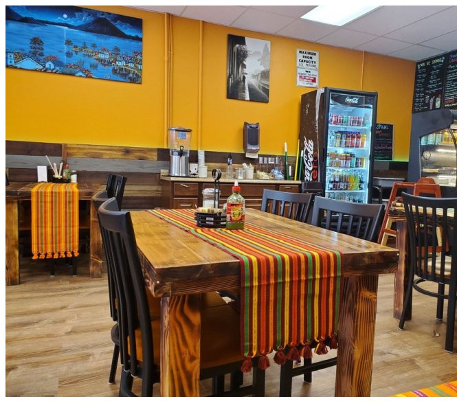
Café Guatemalteco interior with painted walls, wooden tables and a woven runner

The Solution

  • Visual Heritage: Grounding the identity in authentic Guatemalan textile motifs, color, and coffee flora.
  • Scalable Versatility: Creating a robust logo lockup system that functions from 16px digital icons to large exterior storefront signage.
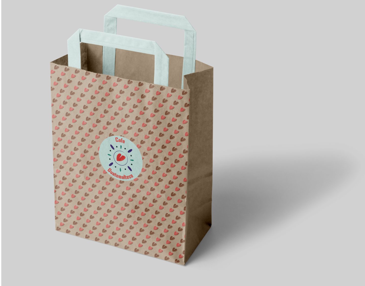
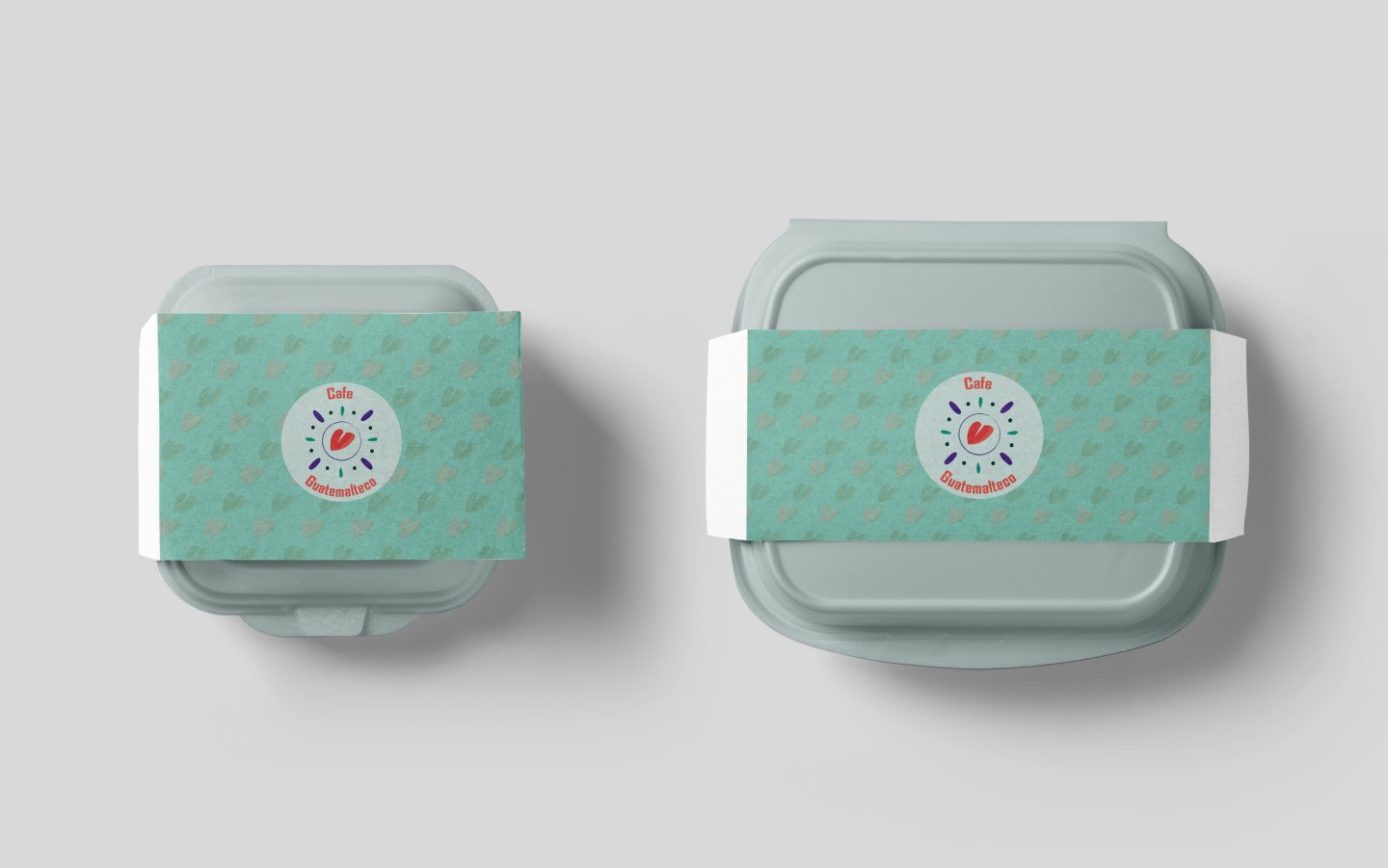
  • Brand Experience: Extending the visual language across packaging, merchandise, and customer touchpoints to build recognition.

Design Thinking Process

A four-stage creative framework grounding the rebrand in cultural heritage, strategic positioning, hand-crafted ideation, and scalable multi-surface execution.

  1. Empathize

    • On-Site Observation
    • Competitive Landscape
    • Heritage Research
  2. Define

    • Brand Narrative
    • Creative Brief
    • Cultural Visual Pillars
  3. Ideate

    • Moodboarding
    • Hand Sketches
    • Typographic Pairings
  4. Design

    • Vector Construction
    • Color Palette
    • Mockups

Empathize Phase

Original Logos

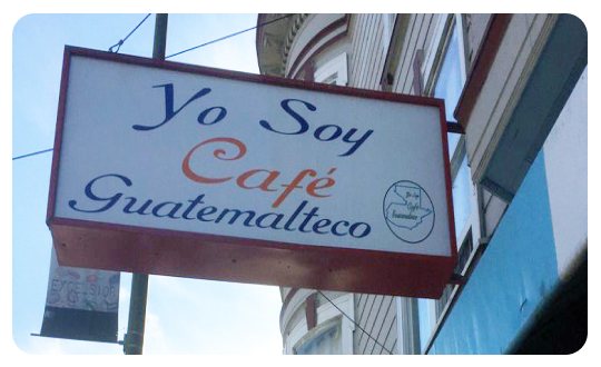
Hanging storefront sign reading “Yo Soy Café Guatemalteco”
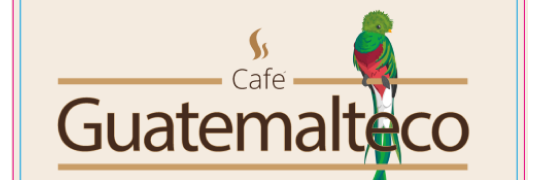
Original logo lockup with the word Guatemalteco and a painted parrot

Storefront

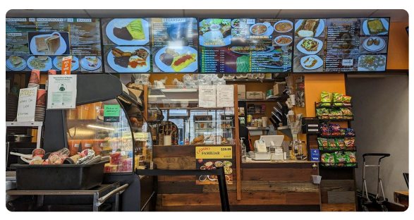
Original storefront windows covered with menu boards and paper signs
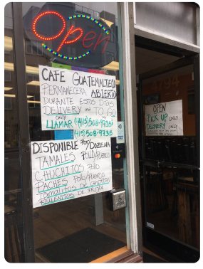
Hand-written “Open” sign and chalkboard menu in the door
Original interior seating area before the redesign

On-Site Observations

  • Welcoming Interior Dynamics: The café operated like a lively neighborhood hub, where regular patrons naturally struck up warm conversations and lingered.
  • Storefront Invisibility: Pedestrians consistently walked past without looking, as the facade lacked a strong visual anchor to catch sidewalk traffic.
  • Environmental Washout: Faint typography and direct window glare caused existing signage to disappear completely from across the street.

Define Phase

Key Insights

  • The Invisibility Gap: Faint, low-contrast signage fails the glance test from the street.
  • Trapped Atmosphere: The genuine warmth and conversation inside never reaches the sidewalk.
  • Visual Disconnect: Exterior aesthetics clash with the authentic cultural experience.
Design Pillars

  • Street-Level Impact: Bold weights and high contrast to cut through midday window glare.
  • Approachable Heritage: Clean geometric cues from Guatemalan textiles, keeping the look modern.
  • Scalable Simplicity: An uncluttered mark that retains clarity at both 24px and 48 inches.

Real-World Constraints

  • Stamp-Friendly: Clean outer lines that won’t bleed on rough kraft paper or cup sleeves.
  • Budget-Minded: Designed to work in single-color ink without requiring costly custom print runs.
  • Fast Signage Cut: Vector geometry optimized for clean vinyl plotter fabrication.

The Core Challenge

How might we translate Café Guatemalteco’s warm, community-driven interior into a bold, high-contrast visual identity that commands street-level attention?

Ideate Phase

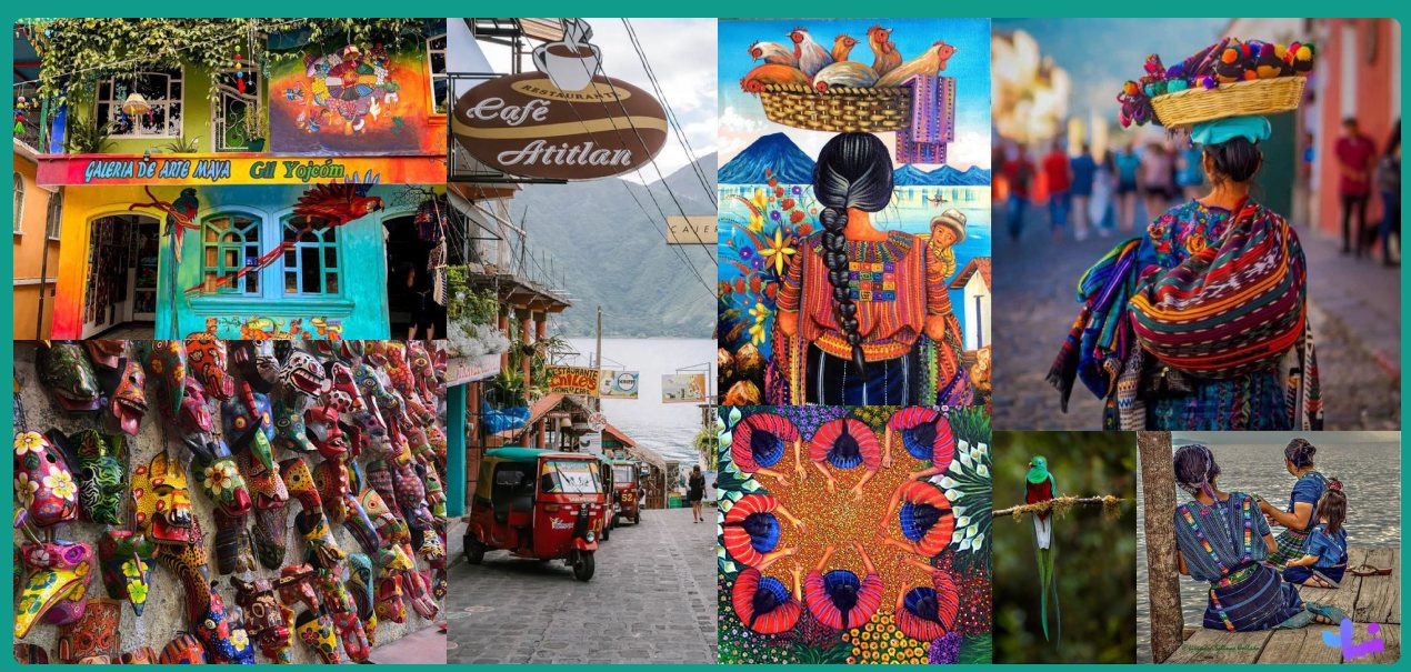
Mood Board

Mood board of Guatemalan textiles, markets, coffee and folk art

Sketches

Tap image to zoom

Ideations

Tap image to zoom

Iterations

Tap image to zoom

Concept Direction & Selection

  • Organic Pattern Masking: Selected the radial emblem on the left to incorporate masked, organic textile-inspired patterns inside the logo—grounding the brand in Guatemalan craft.
  • Heart–Coffee Bean Fusion: Combined a heart silhouette with a coffee bean center to convey warmth, hospitality, and a welcoming neighborhood feel.
  • Approachable Circular Form: Enclosed the mark within a balanced, rounded sunburst silhouette to ensure friendly shelf appeal and strong visibility across storefront signage.

Design Phase

Tap image to zoom

Logo Artwork

Designing the café wanted to focus more on the culture of Guatemala, while also wanting it to be known as a café — which is where the coffee bean heart comes in, to include family.

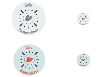
Logo artwork in grey and full color, at large and small sizes

Brand Color

When it comes to Hispanic culture there are a lot of vibrant colors, so I wanted these colors to pop and took the greenish color from the native bird.

  • #009989RGB: 0, 153, 137
    CMYK: 82%, 18%, 54%, 1%
  • #503E3ARGB: 80, 62, 58
    CMYK: 55%, 65%, 63%, 48%
  • #583B8CRGB: 88, 59, 140
    CMYK: 81%, 92%, 9%, 1%

Brand Iconography

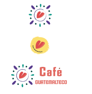
The bottom is the logo without a background; the top two are more for branding objects that would be used on an apron, napkin and coaster. The yellow is more for the smaller objects.

Three icon variations: the emblem without background, the yellow heart badge, and the horizontal Café Guatemalteco lockup

Logo Clearspace

The clear zone of the “C” part of the logo signature name

Tap image to zoom

Brand Typeface

Armada felt more ancient and old with its style; together it feels like you are looking straight at the font, this being used in the logo. Trilby is used in the menu with the different styles based on hierarchy — the black being for the title of the menu, while medium italic is for the subtitle of the food category.

  • Trilby, Regular
  • Trilby, Black
  • Armada BoldCondensed
  • Trilby, Medium Italic
Tap image to zoom