All projects

Interactive Prototype

Gather

Life’s better when we Gather.

My Role

UI Designer & Interactive Prototyper

Project Duration

3-Week Sprint

Tools: Adobe Illustrator, InDesign, Photoshop and Figma
  • User Research
  • Information Architecture
  • Wireframing
  • Interactive Prototyping
Jump to Prototype
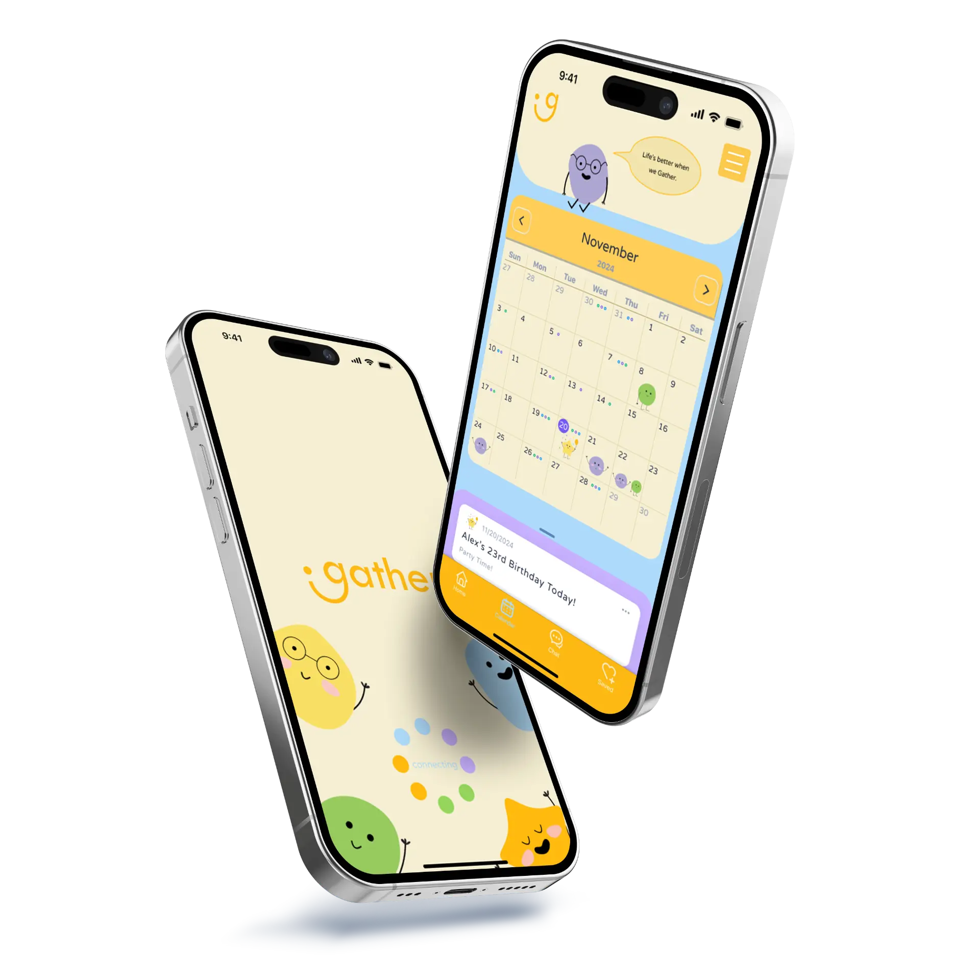
Two phones showing the Gather splash screen and shared calendar

Project Overview

Gather is a delightful mobile app designed to help close friends coordinate and stay connected despite demanding, conflicting schedules. Created as part of a Delightful Design sprint at SFSU, the project explores the balance between hedonic design (instant joy, playfulness, and cuteness) and eudaimonic design (deeper fulfillment and long-term personal well-being).

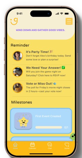
Gather home screen with reminders and milestones

Problem Statement

Existing calendar tools feel like corporate admin, causing friend groups to abandon plans in chaotic group chats. Without a warm, social-first space built for everyday friendships, coordinating across busy schedules becomes exhausting and spontaneous hangouts stall before they ever happen.

Target Audience

  • Busy Students & Friends: Close-knit groups balancing heavy schedules who want quality time without logistical burnout.
  • Spontaneous Planners: Users seeking low-pressure, casual hangouts rather than rigid, corporate-style calendar invites.
  • Core Need: A friction-free availability hub that replaces planning anxiety with warmth and playfulness.
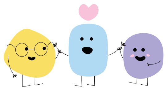
Three Gather mascots holding hands

The Solution

  • Instant Availability Sync: Visualizes overlapping free time across friend groups to eliminate endless back-and-forth messaging.
  • Shared Hangout Wishlist: Lets friends save and vote on local spots and activities, turning planning into a collaborative ritual.
  • Centralized Plan Hubs: Combines group chat, location pins, and RSVPs in one screen to prevent fragmented communication.
  • Reassuring, Delightful UI: Pairs warm character design with intuitive micro-interactions to lower social friction and encourage connection.

Design Thinking Process

A four-stage human-centered process balancing hedonic delight (playful, low-pressure interactions) with eudaimonic purpose (meaningful, real-world friendship).

  1. Empathize

    • Competitive Audit
    • Friendship & Color Research
    • Student Schedule Insights
  2. Define

    • Pain Points
    • User Storyboarding
    • Hedonic/Eudaimonic Goals
  3. Ideate

    • Brainstorming
    • Card Sorting
    • User Flow
  4. Design

    • Wireframing
    • Custom Mascot & UI Kit
    • Prototype
  5. Test

    • Evaluation Rubric
    • Peer & Mentor Critique
    • Improvements

Empathize Phase

Competitive Audit Table

Tap diagram to zoom

Key Takeaway

Logistics Over Connection

Existing calendar apps organize dates well, yet lack the warmth needed to make everyday meetups feel effortless.
Friendship Needs Low-Barrier Touchpoints

Grounded in APA friendship science, maintaining close ties relies on consistent, casual check-ins rather than formal planning.

Emotional Safety Drives Action

To help busy friends follow through, the interface must feel reassuring and inviting rather than like another task list.

Color & Emotion Research

To ensure Gather felt supportive rather than stressful, we researched UI color psychology principles and how color shapes emotional perception. Drawing on the concept that meaning matters, we combined warm, optimistic tones with calm, grounded hues to create a cozy, approachable atmosphere—using vibrant accents intentionally to guide users toward key actions without visual overwhelm.

Tap diagram to zoom

Define Phase

How Might We

How might we turn hangout planning from an administrative chore into a playful, low-pressure ritual for close friends?

Hedonic Goals

Lowering planning friction through warmth

  • Playful Visuals: Expressive star mascot and soft, rounded UI that feel welcoming rather than corporate.
  • Rewarding Micro-Interactions: Friendly prompts that make checking in feel lighthearted.

Eudaimonic Goals

Turning check-ins into real-life closeness

  • Frictionless Syncing: Surfacing mutual free windows without awkward back-and-forth texts.
  • Shared Rituals: Collaborative hangout wishlists and memories that strengthen lasting friendships.

Ideate Phase

Lo-Fi Wireframes

Tap diagram to zoom

Exploring Low-Friction Flows

Welcoming Entry

Tested a friendly "Let's Get Together" splash screen to set a warm tone before showing any schedules.

Visual Calendar Over Text

Explored a clean monthly grid so users could spot free days at a glance instead of reading long chat threads.

Quick Event Prompts

Sketched lightweight invite cards to keep hangout creation fast and casual.

User Storyboard

Tap diagram to zoom

User Flow & Information Architecture

Tap diagram to zoom

Design Phase

Modular Character System

Tap diagram to zoom
  • Round, Organic Silhouettes: Designed soft, curved base shapes (Greenie, Bluey, and our Star mascot) to feel warm, friendly, and approachable rather than rigid.
  • Mix-and-Match Expressions: Built interchangeable eyes, arms, and wave poses as modular components so characters can react dynamically to user moods, empty states, and hangout confirmations.
  • Emotional Reassurance: Acts as a supportive companion throughout the app, lowering the social anxiety of coordinating plans.

Hi-Fi Screens

Tap diagram to zoom

Test Interactive Prototype

Try clicking through the core user flow above

Open Prototype in Full Screen ↗
Tap diagram to zoom

Test Phase

Delight & Usability Evaluation

Tap diagram to zoom

Evaluating Delight & Usability

To validate whether Gather balanced playful charm with clear usability, we ran structured walkthroughs with peers and mentors using a 6-dimension Delight Rubric—measuring how captivating, surprising, lively, cute, serendipitous, and reassuring the flow felt in action.

Key Evaluation Takeaway

High Emotional Warmth

Evaluators consistently praised the custom mascots and soft color palette for making hangout planning feel welcoming rather than stressful.

Clear Core Flow

Participants quickly grasped how to view mutual free windows and send low-pressure invites without confusion.

Opportunities for Clarity

Feedback highlighted minor friction points around text contrast on warm yellow buttons and visual density in early schedule views.

Project Reflection & Next Steps

What I Learned

  • Emotion Drives Utility: Designing for eudaimonic connection taught me that reducing social anxiety is just as important as simplifying calendar mechanics.
  • Systems Over One-Offs: Building modular character components and reusable UI patterns kept our 3-week group sprint fast and cohesive.

Next Steps

  • External Calendar Sync: Integrate Google and Apple Calendar APIs so free windows update automatically in real time.
  • Accessibility & Group Testing: Conduct contrast audits across all color themes and test multi-friend group dynamics in live social scenarios.